Eight years ago, I wrote a piece bemoaning the fact that the iPhone’s home screen was too restrictive and boring. It only allowed a single grid of apps or folders, they had to flow in from the top left, there were no widgets, and even the icons themselves never changed.
The title of that piece, the iPhone 5 forecast: a predictable 73 degrees and sunny, became something of a running joke. It was inspired by the icon for the Weather app, which remained exactly the same no matter where you were or what the sky was doing.
Through huge screen size changes, complete design overhauls, and an ever-expanding ecosystem of apps, the iPhone’s home screen remained simple. Meanwhile, Windows Phone was experimenting with Live Tiles and Android was letting users throw widgets anywhere they wanted.
No more. Apple is finally allowing the home screen on iOS 14 to become complicated.
I’m not posting a full preview of iOS 14 today — I’ll wait for the public beta to do that. But I do want to take a close look at the home screen in particular. Apple waited until literally the 14th version of iOS to change the paradigm for the home screen, so it must think these options are worthwhile.
(By the way, I don’t recommend you install the developer beta on your primary phone. Or any phone at all unless you are a developer who needs to test apps, actually. A public beta is coming in July and it’s worth the wait. Nothing catastrophic has happened, but there are still plenty of unpolished edges and bugs.)
The positive way to talk about the boringness of the iPhone home screen up until now is to point out that it has been simple and trustworthy. No matter what oddity an app would throw at you, you could aways hit the home button (or swipe up) to go to a safe space.
That isn’t changing in iOS 14. When you eventually upgrade, all your stuff will be in the same place and nothing will work differently by default. There will be a new section called the “App Library” over to the side, but you are free to pay it no mind.
Offering complexity as an option is a tricky thing, but I think Apple has landed upon a good balance. There are four main ways that Apple is adding complication. None of them are a rebuke of the old way of doing things, but all of them require a different and more involved mental model of what it means to use an iPhone.
Widgets on the home screen
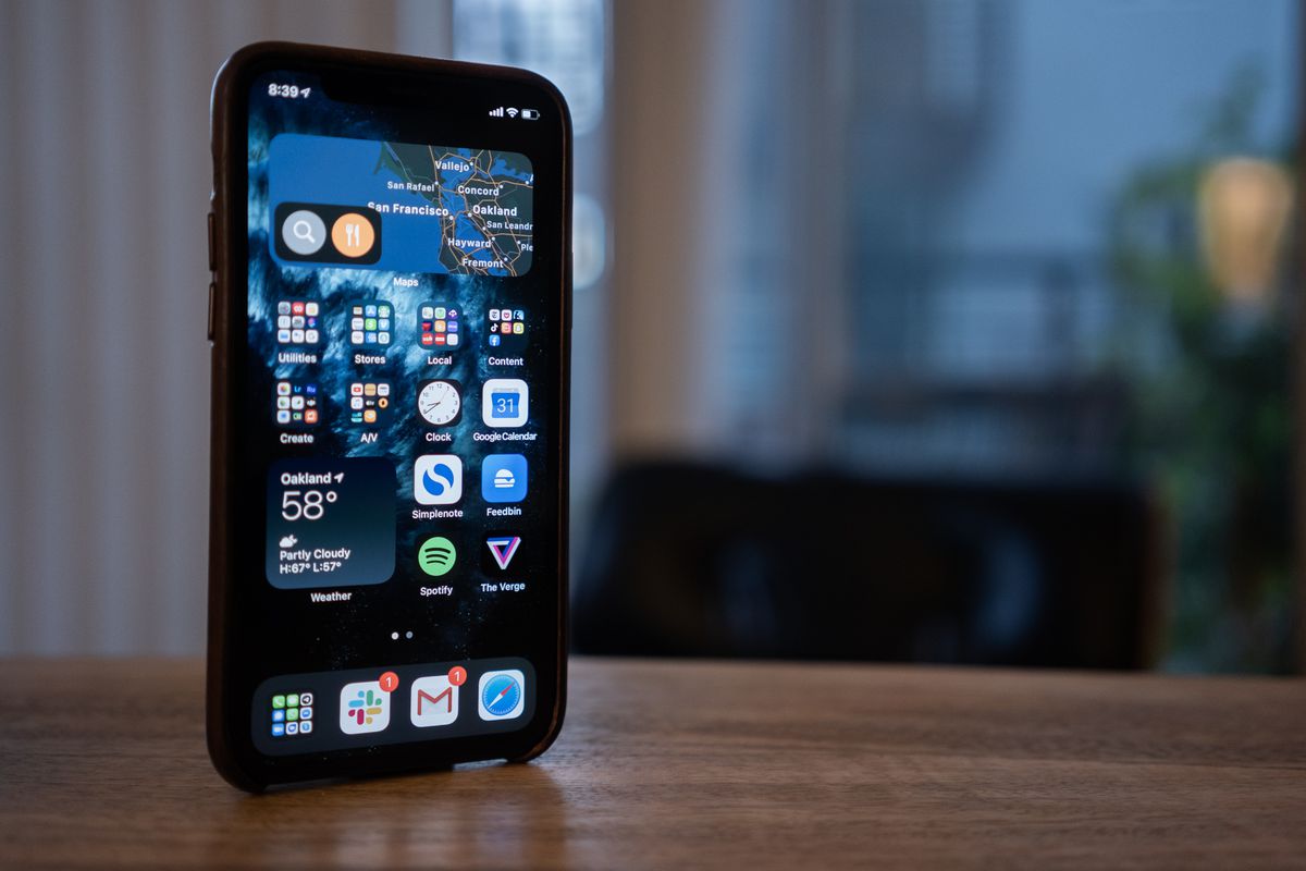
This is the most prominent change in iOS 14. Widgets can come in three sizes (just like Windows Phone), can be placed in a way that tiles the other icons and folders in a clean grid (just like Windows Phone), and so far are very elegantly designed. Android widgets, by comparison, often look like they are creatures from the 2011 lagoon.
To me, though, it doesn’t represent a fundamental shift in Apple’s philosophy of simplicity. We’ve had widgets on iOS before, available in the vertical scrolling “Today” view that’s to the left of your main home screen. (A view, by the way, that is still so much better than the algorithmic dreck that Google and Samsung try to put there.)
You can can “stack” them in a clever way that lets you swipe through multiple widgets. If there’s a philosophical shift here, it’s that Apple is gleefully offering so many different options. Three sizes. Putting widgets on the home screen or in the traditional Today view. The option to have stacks be “smart” and algorithmically surface the most relevant one. All of these are things that would have been antithetical to the old home screen’s ethos of simplicity.
One interesting note: developers are going to need to remake their widgets if they want them to work on the home screen — but that same code can be reused on the next version of macOS. Apple says that’s because the new widgets are updated on Apple’s schedule and therefore eat up less battery life. On that timeline of widget updates, apps can declare the priority of their new information and that might put them at the top of the smart stack. (Hopefully nobody will abuse that feature.)

Jiggle mode and editing pages
Look, I’m calling it jiggle mode. Apple SVP of software engineering Craig Federighi called it jiggle mode in Monday’s keynote, so it’s canon now.
What’s interesting here is that you can get into jiggle mode in so many different ways. A long press on any icon includes an “Edit Home Screen” button, but you can also long press on a black space on the home screen for the first time. That’s been a feature on Android for ages. It’s one of those things that’s a little undiscoverable but wildly useful.
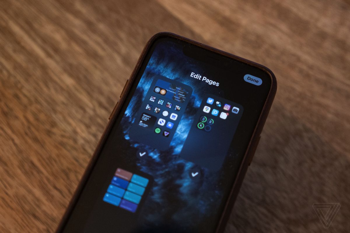
I bring up jiggle mode because there’s another undiscoverable but wildly useful feature hidden in there: “Edit Pages.” If you tap on the navigation dots above your dock, you get a fly-out view of all the pages on your various home screens — again, just like you can do on many Android phones.
But Apple added something new and unexpected here: checkboxes. You can hit a checkbox to turn a page off without deleting everything that’s on it. It seems like a weird feature until you realize you can use it to customize your phone for different contexts. You could have a page (or three) set up for work, but when it’s time for the weekend you could uncheck them and hide all those apps in exchange for a weekend page.
It’s really well done and something I haven’t seen executed to this degree of simplicity anywhere else.

App Library
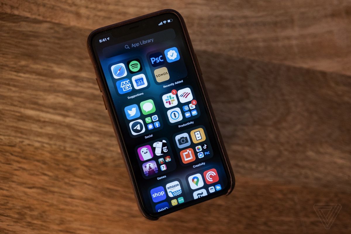
Widgets are flashy, but the App Library is the thing that represents the more fundamental shift for Apple. It’s a bucket where all of your apps live, categorized by Apple. What this means is that your home screen has been split in two: a series of home pages you customize yourself and a single page that lists all of your apps.
That means that your home screen(s) could have two or even three ways to find your app: in an icon you placed, in the App Library, or even from a widget.
If you’re an iPhone user, this is going to feel foreign and strange. If you’re an Android user, this is old hat. Android has had a separate home screen and app drawer since it was first released.
I hope that Apple’s take on this concept evolves over the course of the betas. As it stands, App Library is a somewhat maddening experience. Apple automatically groups your apps into categories that sometimes make little sense and there’s no way to change them. There are not enough visual indications that tapping on the big icons opens an app directly while tapping on the little ones opens up the category.
Apple handled the potential confusion of uninstalling apps vs removing them from the home screen fairly well, though. Now, the “x” icons are minus symbols, and tapping one pops up a very clear dialog box with very clear options for what will happen next.
Most of all, I’m just relieved that I can finally get rid of the “Apple Junk” folder that’s sat on my last home screen ever since folders were introduced on the iPhone.

App Clips
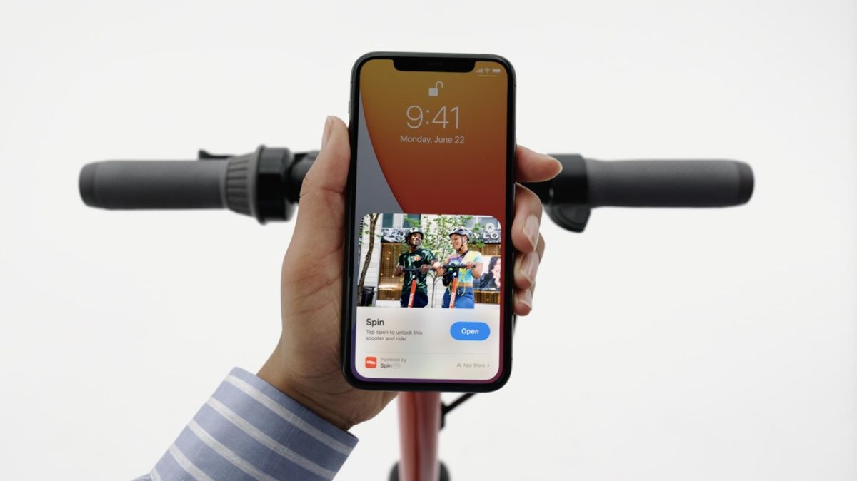
App Clips are like Instant Apps on Android — little mini versions of apps you can use without having to go through the folderol of installing something through the App Store. They need to be smaller than 10MB and they show up in your App Library with a little dotted line around them to denote their temporary status. They disappear automatically after 30 days unless you go in and manually convert them to full apps.
Think of them as living in between the extreme transience of a browser tab and the frustrating “why is that still on my phone” permanence of an app on your home screen. They can do things web pages can’t, but are less burdensome than real apps.
I don’t have the time (or maybe the emotional wherewithal) to get into all the issues App Clips and Instant Apps raise. I dropped a small Twitter thread with some gestures to why I wish that these kinds of apps weren’t necessary — and maybe I’ll get into it for real another time.
For our purposes here, it’s just important to note that App Clips add yet another layer of metaphorical complexity on top of the already-more-complex home screen / App Library split. Will users understand what an App Clip is or why they might care? Will they know why some icons in their App Library have dotted lines? Will they be confused when those apps disappear?
I think that these questions will end up being lower stakes than they may seem at first blush. But I also think it’s fascinating that Apple is willing to make a UI that raises those questions in the first place. That just doesn’t happen very often on the iPhone.

Simple by default, complicated by choice
All of the above could change before iOS 14 is released. Apple could tweak the App Library, jiggle mode could get invoked in a new way, widgets could come in yet more sizes.
Hell, Apple could finally allow you to put an icon at the bottom of a home screen instead of forcing everything to pack in from the top left. Just kidding, that would be madness! (Sigh.)
What’s more important than any of these preliminary impressions is the overall observation: Apple is finally letting the iPhone home screen get complicated. I’m using precise wording here: “letting.” The complicated new UIs and metaphors Apple is putting into the home screen are totally optional.
You don’t need to actually learn any of this stuff if it all seems unnecessary to you — and more power to you. iPadOS, by comparison, has made text selection and windowing get complicated — they’re harder to avoid. iPadOS doesn’t seem to do anything to fix that. Ironically, so far as I know neither inline widgets nor the App Library are coming to iPadOS, which means the iPhone now has a more complex home screen than the iPad.
Apple has fully swung from a years-long obstinate refusal to change up the iPhone home screen to stacking multiple new ways of thinking about these little icons all on top of each other in a single release, all at once. Apps not only can appear in multiple places, but there are multiple kinds of apps and widgets. Home screen pages can be toggled on and off.
Apple usually takes years to build up to these new interface metaphors. But with the iOS 14 home screen, they’re all landing at once. I’m glad they’re finally here and I’m glad that you can choose to ignore most of them if you prefer. Mostly, though, I wish that it hadn’t taken over eight years to get here.
More from WWDC 2020
┏ Our biggest burning question about Apple’s ARM silicon.
┏ Apple will extend the lifespan of your AirPods by choosing when they charge. I think every gadget with a rechargeable battery should do this.
┏ New iOS 14 feature lets the iPhone alert you if it hears sounds like a doorbell or fire alarm. Ashley Carman:
For now, Apple seems focused on using sound recognition for everyday accessibility purposes, and the company discourages anyone from depending on it for staying safe. The settings screen says “Sound Recognition should not be relied upon on in circumstances where you may be harmed or injured, in high-risk or emergency situations, or for navigation.”
┏ Apple’s new iOS 14 home screen brings Windows Phone Live Tiles back to life. Tom Warren:
Apple has taken the best of both Android widgets and Windows Phone’s Live Tiles and combined them into iOS 14. It’s not the first time we’ve seen Windows Phone features appear in iOS or Android, and it underlines how important Microsoft’s mobile efforts were even if they were a glorious failure.
┏ All the new features iOS 14 borrows from Android. These lists are fun and you know what? More borrowing good ideas please.
The end of Mixer
┏ Mixer failed — here’s why. Bijan Stephen has, as ever, the smartest take on live streaming platforms:
Mixer was doomed from the start because what Microsoft never seemed to understand was that its live-streaming platform was first and foremost a community. That’s not to disparage the streamers on Mixer or the fans who followed them there. Those relationships are real, solid, and will probably last even as streamers leave the platform for greener pastures — adversity binds, after all. What I mean is that Microsoft never marketed Mixer as anything more than a more technologically advanced version of Twitch, and it couldn’t seem to figure out how to showcase the community it was building.
┏ Microsoft’s Mixer streamers are sad, angry, and moving to Twitch. Tom Warren spoke to a ton of people in the Mixer community:
Most Mixer partners I spoke to had decided to move to Twitch or were leaning that way, despite Facebook reportedly offering a one-time $2,500 sign-up bonus to Mixer partners who choose to move. Most simply feel like Twitch is the bigger platform and that Facebook is too personal, with a lack of anonymity for viewers or streamers.
┏ Mixer was a failure, but it kicked off a talent war for streamers. Andrew Webster:
Now we’re set for arguably the biggest free agency frenzy in the history of streaming. Suddenly, all of those big names that Microsoft spent millions of dollars to lure in are searching for a new home. Because the landscape has changed so much, it’s not clear where they will land. The obvious choice for many would be Twitch, but YouTube has also emerged as a strong competitor. Cory “King Gothalion” Michael, who joined Mixer last October, has already announced that he’s moving to Facebook.
More from The Verge
┏ Google is on a mission to stop you from reusing passwords. Jay Peters:
Password Checkup took about two to three years from inception to having it appear in many Google products, according to Thomas. Down the line, Google wants to have Security Checkup email you when it detects that a stored login has been compromised in a data breach, which the company plans to launch in the coming months. And later this year, Google aims to let people use Password Checkup in Chrome even if they aren’t logged into a Google account.
┏ Superhuman’s email app is overhyped and overpriced. Chaim Gartenberg:
The problem with Superhuman is that you have to be willing to use the app Superhuman’s way. The app is heavily reliant on its hotkeys, but you can’t change or edit them to your liking. Deleting email will always be Shift-3, and the only way to switch between accounts is by using the Control key. Some of that is fine; I’ve used email apps with settings menus so complex as to be immediately off-putting to even bother changing anything. But it also leads to some frustrating interactions when you don’t fit into the Superhuman-sized box.
┏ Acer’s new rugged laptop has a water-repelling fan inside it. Monica Chin:
The N3 has achieved MIL-STD 810G and IP53 certifications. The former guarantees durability from incidents like shocks, drops, and vibrations. The latter means it can withstand certain quantities of dust and spraying water. The laptop also includes what Acer calls an Aquafan, which repels water from all angles from inside the laptop.

Introvert. Beer guru. Communicator. Travel fanatic. Web advocate. Certified alcohol geek. Tv buff. Subtly charming internet aficionado.
