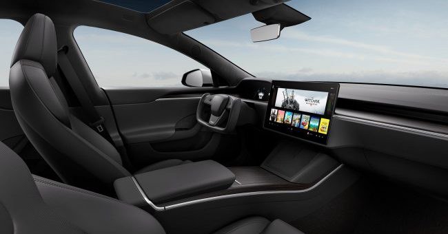
The shooters are gone due to the minimalist aesthetics of the cockpit. More and more manufacturers are abandoning more and more physical buttons. Its functions are transferred to touch screens or touch buttons. Of course, not everyone likes this. Pressing a physical button is a clear and simple operation. They are easier to find without taking your eyes off the road. But automakers believe the minimalist aesthetic redeems what many see as drawbacks.
However, the Tesla rail handles have also been dropped due to a clear reduction in the role of the driver. Tesla wants to produce autonomous cars in which all people will be just passengers. For the same reason, the steering wheel of the Model S and Model X has been reduced: who needs a large steering wheel if it is used infrequently? It is a way for people to get used to the cars of the future.
So Elonas Muskas says that the most luxurious and updated Tesla models will know which way to go. An algorithm that analyzes the information from various sensors will decide what the driver wants to do. Sometimes the task will be quite simple – a car standing on the wall of the garage will probably not move forward. But sometimes it will be more difficult for the car to understand where the driver wants to drive. For example, if you want to turn on a wide road or go back to the garage.
In other words, it is essential that the driver can choose the direction of travel. It was previously announced that there would be a button on the center console for this. However, Tesla does not like buttons, and this function moves to the center screen.
Tesla drivers have different views on this innovation. Some think that this will not be a problem. Others say that Tesla is solving a problem that doesn’t exist. The physical buttons, knobs, and levers are comfortable, easy to find at hand, and reliable – do you really need to give them up?