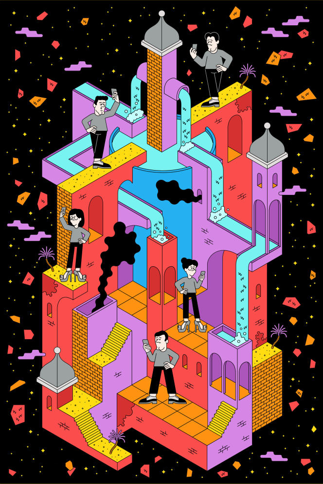
Would video games benefit from being shorter? This is the question that preoccupied the eight members of the London studio Ustwo in 2013. Some are approaching their thirties, others are past; their professional agendas and their personal lives are full. Therefore, it is difficult to go after adventures that sometimes last several tens of hours.
What if they made up a short game that everyone could finish? This would be in line with his plan to design an inspiring and creative smartphone game: “We told ourselves that this would prevent us from repeating ourselves or stretching concepts. We would respect the player’s time, says English Danny Gray, the producer. All we wanted was to drive the player within a very beautiful place. “
The beautiful place in question is called Monument Valley. The player explores it with Ida, a princess dressed in white. It takes you through ancient and magical buildings. In fact, they are riddles. By touching the screen with the tip of your finger, you have to move walls, rotate bridges, turn handles or activate buttons so that the girl reaches the top of the buildings.
A profound quirk emerges from these levels of dusty tones. Architecture reveals impossible perspectives. From the first painting, Ida walks down a catwalk that forms a Penrose triangle, a geometric shape whose edges overlap without knowing what is inside or outside. The game is thus placed under the sign of illusion.
Counterflow
Combining brevity and absence of difficulties, the game costs a handful of euros, an aberration in the small world of mobile video games that at that time favored free downloadable experiences but where the player was encouraged to buy items that would help them progress . At first glance, nothing should work. And yet the magic worked.
Monument valley it has a sophisticated aesthetic that contrasts with the canons of the time. « L’App Store [le magasin d’applications d’Apple] was dominated by Clash of Clans, Candy Crush Saga Where Angry Birds, recalls Ken Wong, the chief designer. Everyone thought that mobile games were cheap experiences. No matter how addictive they were, they weren’t cutting edge in art and design. “
Lamenting the rudimentary graphics of gaming on iPhone and iPad, this Australian dreams of an experience inspired by the high-end design of Apple devices. The first sketches he offered to Ustwo were oriented towards minimalism and learned nuances. The concept of Monument valley emerges from one of them. “I drew a building floating in the air with a little character on it, He describes. I hung it on the wall and a lot of people stopped to tell me it was interesting. “
You have 65.79% of this article to read. The rest is for subscribers only.

Introvert. Beer guru. Communicator. Travel fanatic. Web advocate. Certified alcohol geek. Tv buff. Subtly charming internet aficionado.